
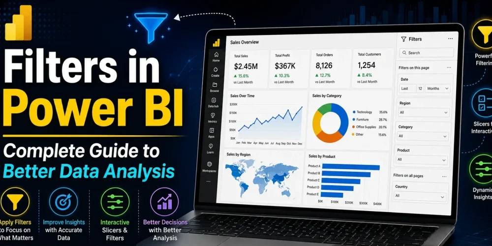
Data analysis becomes much more useful when people can focus only on the information they actually need. A report filled with thousands of rows and multiple charts may look detailed, but without proper filtering, it quickly becomes difficult to understand what matters most. This is one of the main reasons filters are so important in Power BI for creating analytical dashboard.
Filters allow users to narrow down data and explore reports from different perspectives. Instead of looking at an entire dataset at once, users can focus on specific regions, products, departments, or time periods. This makes dashboards more interactive and helps businesses make faster decisions based on relevant insights.
One of the strongest advantages of Power BI is its ability to create dynamic reporting experiences. Different users can interact with the same dashboard while analyzing completely different scenarios. A sales manager may focus on quarterly revenue, while a marketing team may use the same report to evaluate campaign performance. Filters make this flexibility possible.
What Are Filters in Power BI?
Filters in Power BI control which data is visible inside a report or visual. Instead of displaying every record from a dataset, filters allow reports to show only the information that matches selected conditions.
For example, imagine a company dashboard that contains worldwide sales data. A regional manager in Europe may not need to see sales from Asia or North America. By applying filters, the dashboard can instantly display only European sales data. The same concept can apply to customer segments, product categories, date ranges, or employee performance.
Filters are especially valuable because they make dashboards easier to read. Large datasets often create cluttered visuals that are difficult to analyze. Once filters are applied, reports become cleaner and more focused.
It is also important to understand that filtering and sorting are not the same thing. Sorting changes the order of data, while filtering changes the actual data being displayed.
Why Filters Matter in Power BI
Modern business intelligence is not only about creating charts. It is about helping users explore data efficiently. Filters play a major role in this process because they improve both usability and analysis.
Without filters, users would need separate reports for every department, region, or scenario. Filters solve this problem by allowing one report to support multiple views of the same dataset. This reduces report duplication and creates a more flexible reporting environment.
Filters also improve dashboard interaction. Instead of reading static visuals, users can actively explore data and discover patterns on their own. This creates a more engaging analytical experience and allows decision-makers to investigate issues more deeply.
Another major benefit is performance in communication. A dashboard overloaded with information can confuse users. Filters simplify the view and help users concentrate only on relevant insights.
Read More: Data Types You Need to Know in Power BI
Types of Filters in Power BI
Power BI provides several types of filters, and each one serves a different purpose within a report.
1. Visual Level Filters
Visual level filters affect only a single visual. This means the filter applies to one chart, graph, or table without changing the rest of the report page.
For example, a dashboard may contain multiple visuals showing sales, customer growth, and profit margins. A visual-level filter can be used to display only electronics sales in one chart while the remaining visuals continue showing all categories.
This type of filtering is useful when certain visuals need to focus on specific business conditions without affecting the overall report.
2. Page Level Filters
Page level filters apply to every visual on a single report page. Instead of configuring filters individually for multiple charts, users can control the entire page with one filtering condition.
Suppose a company has separate pages for different regions. A page-level filter can ensure that every visual on the “Asia Region” page displays only Asian market data. This keeps reporting consistent and saves development time.
Page-level filters are widely used in departmental reporting, regional dashboards, and quarterly analysis pages.
3. Report Level Filters
Report level filters affect the entire report across all pages. Once applied, every page inside the report follows the same filtering condition.
For instance, a report-level filter may be set to display only data from the current fiscal year. Every chart and table inside the report will automatically follow this condition.
These filters are helpful when businesses need consistency across large reporting environments.
4. Drillthrough Filters
Drillthrough filters are designed for deeper analysis. They allow users to move from summary information into detailed reporting views.
For example, a sales dashboard may initially display overall revenue by product category. When users click on a specific category, Power BI can open another page containing detailed customer transactions, regional sales, and profit analysis for that category.
This creates a smoother analytical experience because users can investigate details without leaving the report environment.
Slicers in Power BI
Slicers are among the most commonly used filtering tools in Power BI dashboards. Unlike traditional filters that remain inside the filter pane, slicers appear directly on the report canvas and allow users to interact with data visually.
A slicer may appear as a dropdown menu, a list of categories, or even a date range selector. Users can simply click on values to update all connected visuals instantly.
This is one of the reasons slicers are so popular in interactive dashboards. They make reports feel more responsive and user-friendly.
Date slicers are especially useful in operational reporting because they allow users to switch between weekly, monthly, or yearly analysis quickly. Range slicers are also commonly used in financial dashboards where users may want to filter sales or profit between certain values.
How to Add Filters in Power BI
Adding filters in Power BI is relatively simple, but understanding where and how to apply them is important for building effective reports.
The process usually begins with the filter pane located on the right side of the Power BI interface. Users can drag a field into the desired filter section depending on whether the filter should affect a visual, page, or the entire report.
Once the field is added, Power BI provides multiple filtering options. Users can select specific values, create advanced conditions, or apply date-based filtering logic.
For example, a sales report may use:
- A basic filter to display only one region
- An advanced filter to show sales greater than a certain amount
- A relative date filter to display only the last 30 days
After the filter is applied, visuals update automatically based on the selected condition.
Dig deeper into how to build a business Intelligence Strategy step by step.
Basic Filters vs Advanced Filters
Power BI supports both simple and advanced filtering methods.
Basic filters are straightforward and beginner-friendly. They usually involve selecting values from a list. For example, users may select specific countries, product categories, or departments.
Advanced filters provide more flexibility. Instead of selecting values manually, users can define logical conditions. A company may want to display products with sales above a target value or customers whose names contain certain keywords.
Advanced filtering becomes especially useful when reports contain large datasets and more analytical control is required.
Relative Date Filters in Power BI
Relative date filtering is one of the most practical features in Power BI because it allows reports to update dynamically based on current dates.
Instead of manually changing filters every month, users can configure reports to automatically display:
- Last 7 days
- Current month
- Previous quarter
- Last 12 months
This is extremely valuable for operational dashboards and executive reporting because the information stays updated automatically.
Top N Filters
Top N filters are commonly used in performance analysis. They allow reports to display only the highest or lowest performing values.
For example, businesses often use Top N filters to identify:
- Top-selling products
- Highest revenue customers
- Best-performing sales representatives
These filters help organizations focus on the most impactful areas of their business.
How Filters Affect DAX Calculations
Filters are closely connected to DAX calculations in Power BI. One of the most important concepts here is filter context.
When a filter is applied, DAX measures automatically recalculate based on the visible data. This makes Power BI highly dynamic.
For example, a total sales measure may produce different results depending on the selected region or time period.
Functions like CALCULATE and FILTER are commonly used to modify filter context inside DAX formulas. Developers often use these functions to create customized business calculations and analytical logic.
Common Problems with Filters in Power BI
Although filters are extremely useful, users often encounter challenges while building reports.
- One of the most common issues occurs when filters do not behave as expected. This is often caused by incorrect relationships between tables or conflicting filter conditions.
- Performance can also become a concern in large reports. Excessive slicers, complicated DAX calculations, and poorly designed data models may slow down dashboards significantly.
- Another common issue is poor user experience. Some reports contain too many filters on a single page, making dashboards difficult to navigate. Users may feel overwhelmed when too many filtering options appear at once.
Best Practices for Using Filters in Power BI
The best Power BI dashboards usually follow a simple filtering structure. Instead of overwhelming users with dozens of filter options, effective reports guide users toward the most important insights.
Slicers should be used carefully and only where they improve interaction. Too many slicers can reduce readability and negatively affect performance.
It is also important to organize filters logically. Filters related to dates, geography, and products should follow a consistent structure so users can navigate reports easily.
Optimizing the data model is another important practice. Clean relationships and efficient DAX calculations improve both filtering performance and report responsiveness.
Businesses should also test reports from an end-user perspective. A technically correct dashboard is not always user-friendly. Good filtering design should feel intuitive for both technical and non-technical users.
Real-World Use Cases of Filters in Power BI
Filters are used across almost every industry because businesses need flexible ways to analyze data.
Sales teams use filters to compare regional performance and identify top-selling products. Finance departments rely on filters to evaluate quarterly revenue and monitor profit margins. HR teams analyze employee performance and hiring trends using department and location-based filters.
Marketing teams also depend heavily on filtering. Campaign performance dashboards often use filters to compare traffic sources, customer engagement, and conversion rates across different time periods. Without filtering, these reports would become much harder to interpret.
Conclusion
Filters are one of the most powerful features in Power BI because they transform static reports into interactive analytical tools. They help users focus on relevant insights, simplify large datasets, and improve the overall reporting experience.
From visual-level filters to advanced DAX filter context, Power BI provides multiple ways to explore and control data. Businesses that understand how to use filters effectively can create cleaner dashboards, improve decision-making, and build more user-friendly reporting environments.
A strong filtering strategy does more than organize data. It helps turn raw information into meaningful business intelligence.